Haskapa UK launched in early 2020 and formed a new product focus away from the previous Canadian range of ‘fine foods’, moving into the D2C health & wellness sector.
In an e-commerce market crowded with transient design and faddish products, an established-looking approach for branding and packaging was preferable.
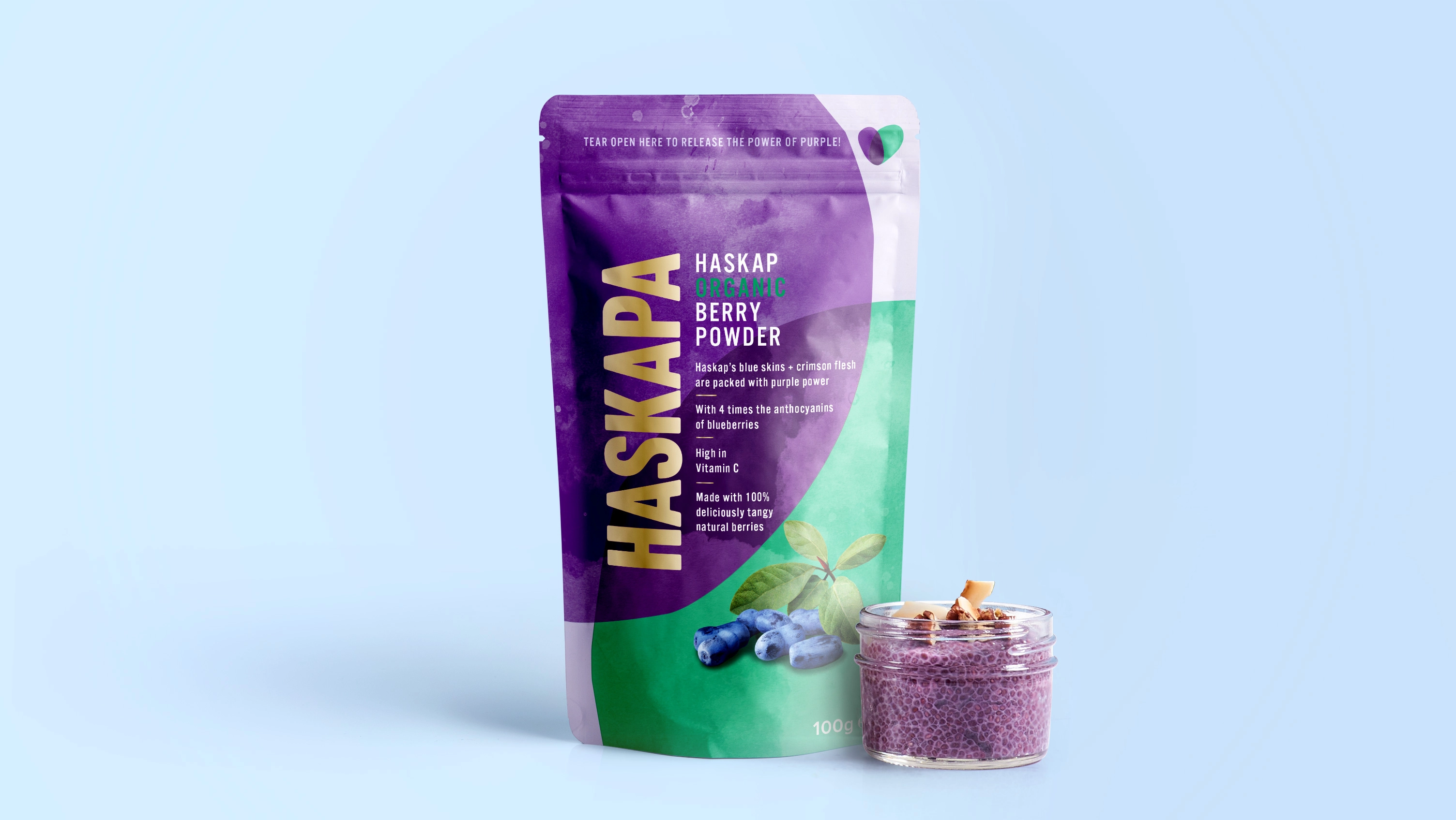
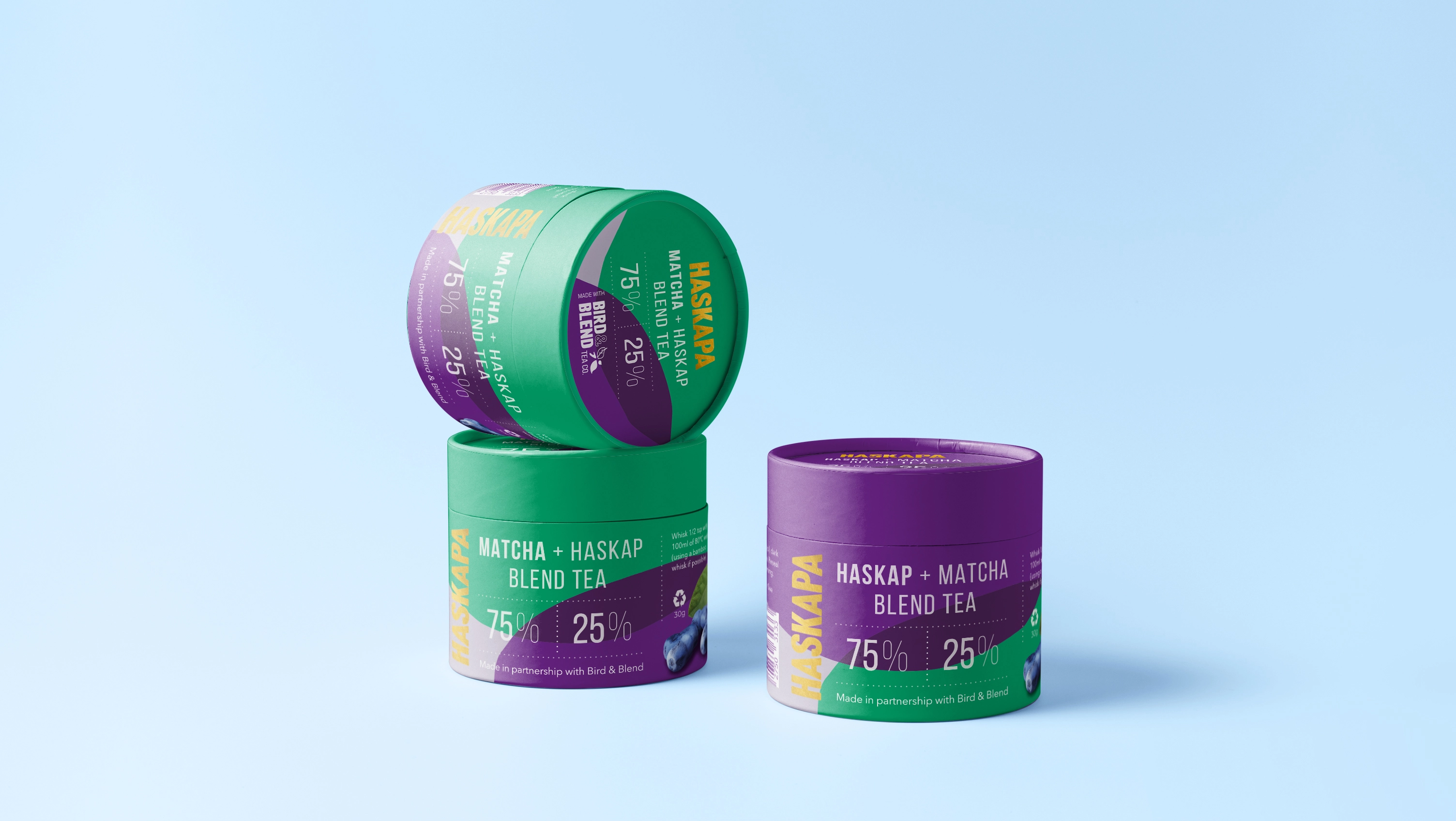
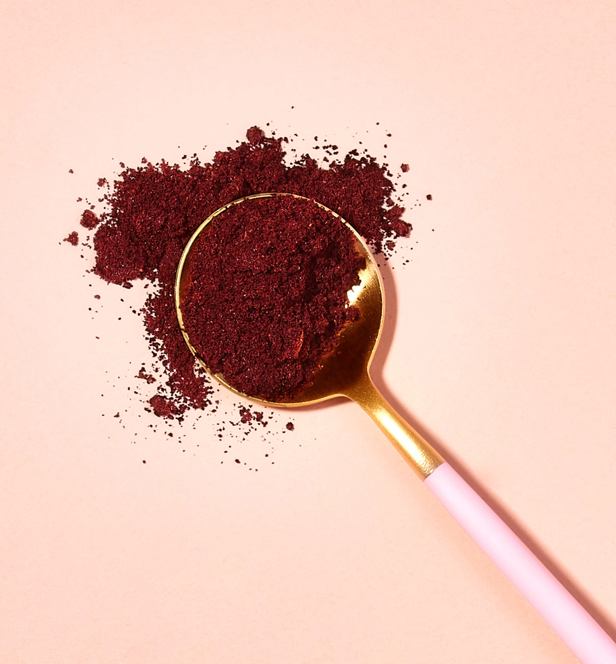
The concept of overlapping venn-style curved graphics is based on the berry itself, which has a blue skin and crimson flesh that when blended turns foods purple. Gold tones were added to the palette as a mark of quality and purity.
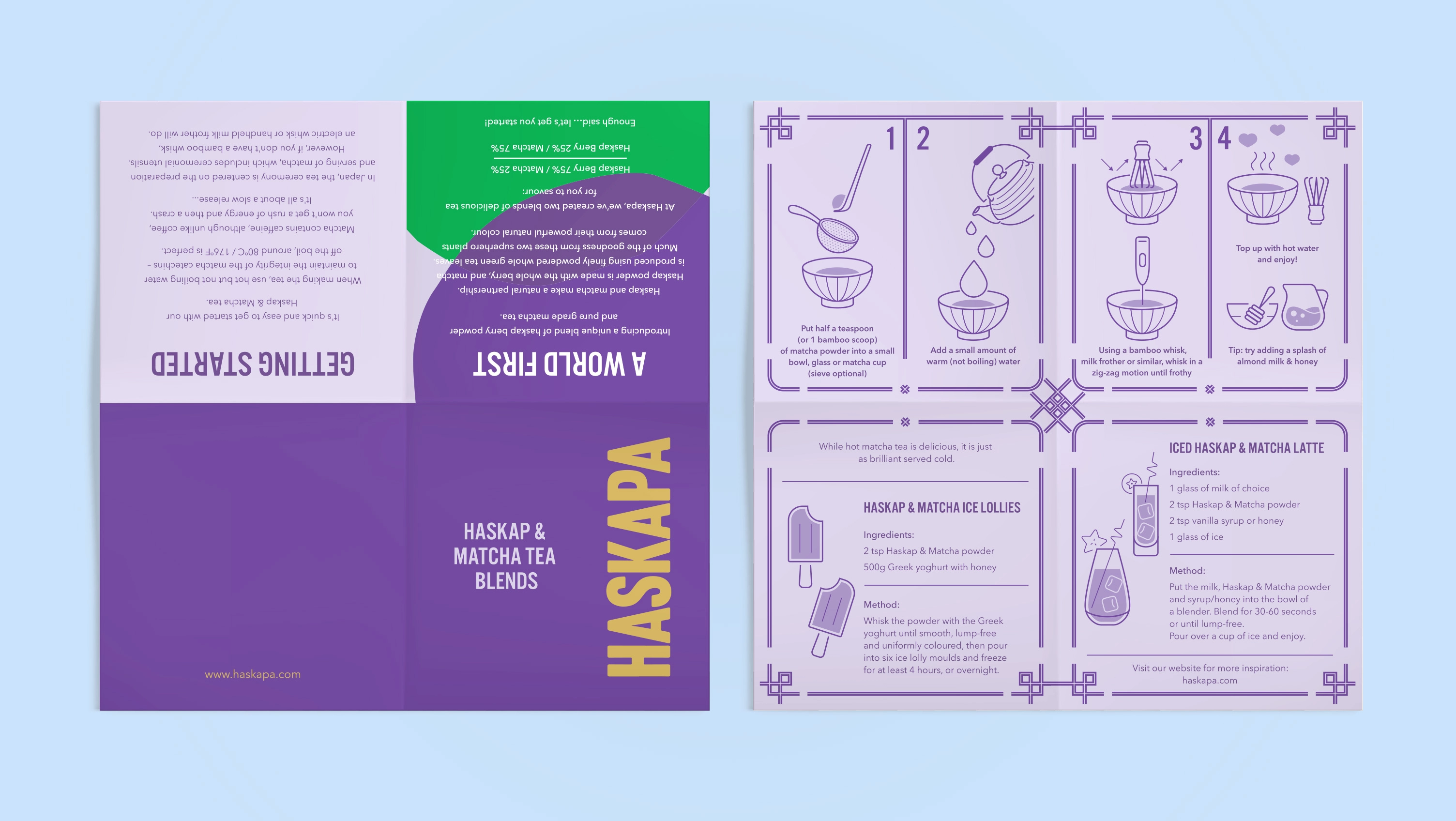
Haskapa UK launched with Berry Powder and swiftly followed by Matcha+Haskap Blend Tea.
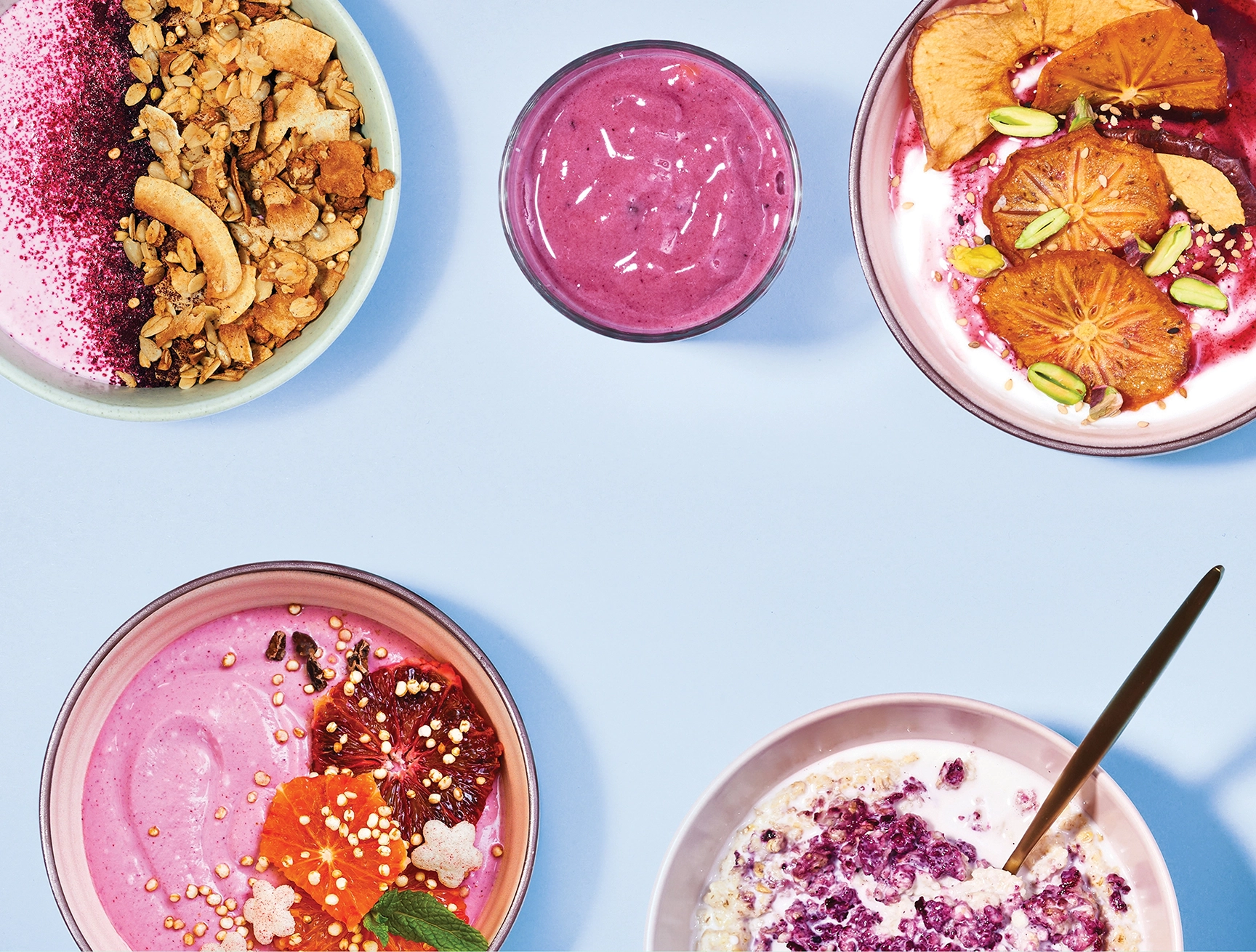
A clean, crisp photographic style conveys natural health and product versatility..